Responsive design is a crucial aspect of modern website design that has become increasingly important in today’s digital world. With the growing use of mobile devices for accessing the internet, websites need to provide a seamless and enjoyable user experience to their visitors, regardless of the device.
One great example of a responsive website is the online retailer Amazon. If you visit Amazon’s website on a desktop computer, you’ll see a large, full-width layout with multiple sections and categories. However, when you visit the same website on a mobile device, you’ll notice that the configuration has changed to a more streamlined version, with larger text and buttons for better navigation. Despite these changes, the content and functionality of the website remain the same, providing an excellent user experience across different devices.
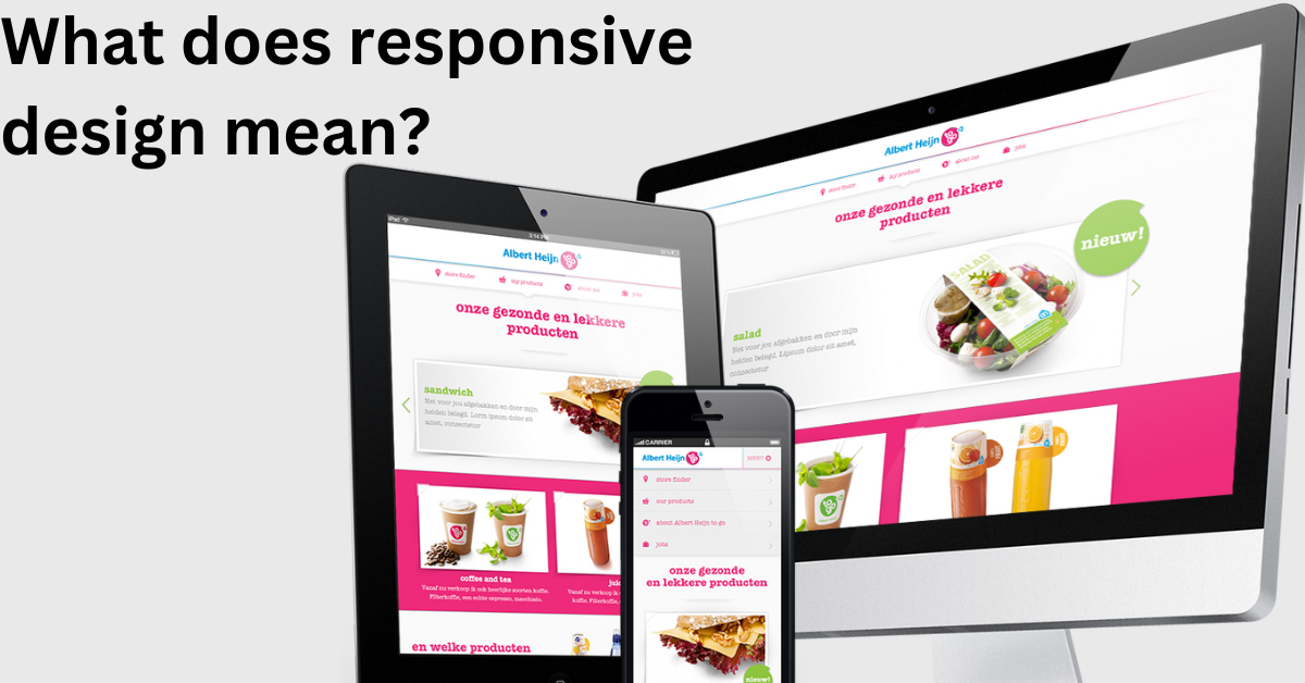
What is Responsive Design?
The term “responsive design” was first coined by Ethan Marcotte in 2010, and since then, it has become a critical aspect of modern website design. It is an approach that enables a website to adapt its layout and content to the size of the device being used to view it. It means that whether someone is browsing your website on a desktop computer, tablet, or smartphone, they will have a great experience. The website will automatically adjust to the screen size, providing an adjusted view, without needing a separate mobile version of the site.

The benefits of using responsive design are numerous. Firstly, it provides a better user experience for your website visitors, regardless of the device. It eliminates the need for a separate mobile version of the site, making it easier for visitors to access your content and interact with your website. Additionally, a responsive design makes it easier for search engines to crawl and index your website, which can improve your search engine optimization (SEO) and overall visibility. One example of a company that has embraced responsive design is Airbnb. Airbnb’s website provides a fantastic user experience, regardless of the device used to view it. The site automatically adjusts to the screen size, providing a streamlined and easy-to-use interface that makes it simple for visitors.
How Does Responsive Design Work?
A responsive design uses fluid grids and media queries. A fluid grid is a layout system that uses relative units, such as percentages, instead of fixed units, such as pixels, to define the size of elements on a page. It allows the layout to adapt to the size of the screen and adjust accordingly.
Media queries are CSS rules that check the conditions of the device, such as its screen size, and apply different styles based on those conditions. With media queries, designers can specify how the layout and content should look on various devices, ensuring that the website provides an optimal viewing experience on all devices. Let’s take the website of CNN as an example. On a desktop computer, the website layout is full-width with multiple sections, including a large header image, navigation bar, and various articles displayed on the home page. However, when visiting the same website on a mobile device, the layout changes to a more streamlined version, with a smaller header image, simplified navigation, and a single article displayed at a time. Fluid grids and media queries help the website adapt to the screen size and provide a good viewing experience.
Related: Drupal vs. WordPress
Benefits of Responsive Design
Responsive design offers many benefits, including:
- Improved User Experience: With responsive design, visitors to a website will have a seamless and enjoyable experience, regardless of the device they are using. It is because the layout and content of the website automatically adjust to the screen size, providing optimal viewing and navigation.
- Increased Accessibility: Responsive design ensures that websites are accessible to all visitors, regardless of the device. It is necessary for individuals with disabilities who may use assistive technologies, such as screen readers, to access the internet.
- Better Search Engine Optimization (SEO): Search engines, such as Google, favor websites that provide a positive user experience, regardless of the device. Websites are more likely to rank higher in search engine results if they have a responsive design, as they provide a good experience for all visitors.
- Reduced Maintenance Costs: With responsive design, there is no need for separate mobile and desktop versions of a website. It reduces the time and cost associated with maintaining multiple versions of a website and ensures that all visitors have the same experience, regardless of the device.
Common Responsive Design Techniques
There are several responsive design techniques that designers use to ensure that websites provide an optimal user experience on all devices. These techniques include:
- Flexible Grid System: This uses relative units, such as percentages, to define the size of elements on a page. It allows the layout to adapt to the size of the screen and adjust accordingly.
- Media Queries: This is a CSS technique that checks the conditions of the device, such as its screen size, and applies different styles based on those conditions. Media queries enable designers to specify how the layout and content should look on various devices, ensuring that the website provides an optimal viewing experience on all devices.
- Fluid Images: This technique ensures that images on a website scale up or down based on the screen size. It helps to maintain the overall visual balance of the layout and prevents pictures from becoming too large or small for the screen.
- Responsive Typography: This technique ensures that text remains legible and readable on all devices, regardless of screen size. Designers use this technique by setting relative font sizes.
With these responsive design techniques, designers can ensure that websites provide an optimal user experience on all devices, improving accessibility and boosting overall success.
Choosing The Right Responsive Design Framework
When implementing responsive design on your website, choosing a great framework is crucial. Here are a few factors to consider when choosing the right responsive design framework:
- User Experience: The framework you choose should provide a great user experience on all devices, regardless of the screen size.
- Compatibility: The framework should be compatible with your website’s existing technology stack, including the CMS you are using, the programming language, and the hosting platform.
- Customization: The framework should allow for customization to meet the unique needs of your website and brand.
- Support: The framework should have a strong community of users and developers who can provide support and resources.
Conclusion – What Does Responsive Design Mean?
This is a crucial aspect of modern web design that ensures that a website provides a great user experience on all devices, regardless of screen size. By using flexible and fluid grids, images, and media queries, responsive design adapts to the different screen sizes of smartphones, tablets, laptops, and desktop computers, providing an optimal viewing experience for users.
The importance of responsive design cannot be exaggerated, as more and more people use their mobile devices to access the internet. With a responsive design website, businesses can reach a wider audience, improve user experience, and increase conversions. It is necessary to consider responsive design when launching a new website. With a responsive design framework, testing, and optimization, your website can provide a great user experience on all devices, improve accessibility, increase performance, and improve search engine optimization.


